
 Translate
Web accessibility
How to make web content that's accessible to visitors with disabilities
Top 12 accessibility tips
Why it matters
Imagine all the photos are missing from a website. Are you not getting some important information the pictures would convey? What words would make the image meaningful and functional? Use that wording to describe the image in the "alt" text.
Creating good "alt" text is important for anyone unable to see the images. This includes screen reader users, low bandwidth users, and search engines.

See detailed "alt" text examples on WebAIM.
Quick tips
- Every image should have an "alt" attribute:
-
<img src="/-/media/help/branding-governance/images/300px-vegetables.ashx?la=en" alt="Healthy vegetable options include beans, tomatoes, cucumbers, squash, and peppers" />
-
- In Sitecore, right-click over the image and select "properties" to update the "alt" text.
- If an image is decorative only, you must still have an "alt" tag, but you can leave it blank like this:
alt="". This tells screen readers to ignore the image. - Don't use images with text in them because screen readers can't read it. Also, the words might scale too small to read on mobile devices, and it may get pixelated if a user zooms in closer due to vision issues. Instead, add that text in HTML above or below the image.
- If you use an image with text and also have the text in HTML below the image, that is called a redundant image. In that case, use a blank "alt" tag like this:
alt="" - If an image is a link, it must have descriptive text, either inside that same
<a>tag or in the "alt" text.-
<a href="/employees/healthy-incentives/pike-place-market.aspx" title="Pike Place Public Market sells healthy vegetable options including beans, tomatoes, cucumbers, squash, and peppers" /> <img src="/help/branding-governance/images/300px-vegetables.ashx?la=en" alt="" ></a>
In the Sitecore editor, right-click over the link and select "properties" to update the "title" text.
-
- Always have a text version available for infographics. Please put the link to the text version before the infographic.
Visitors who use screen readers scan the page to get what they're looking for.
Help these visitors by using headings and by nesting them properly. For example, on a web page, nest the header levels properly:
Heading 1 - Page heading
Heading 2 - Section
Heading 2 - another Section
Heading 3 - sub-section
Heading 3 - sub-section
Heading 2 - another Section
Visitors who use a screen reader jump from header to header to read what's on the page and to locate the section they want.
When pages omit headings, the page isn't scannable and so visitors have to read everything or just exit the page.
Why it matters
Don't create links that say things like: more, read more, more information, visit this link, or click here.
Instead, describe your target page in the link like this: find King County parks. Screen reader users often scan a web page by reading only the links. If a link doesn't have any text that says where the link is going, they might get a meaningless list of links, as in: more, more, more, more...
If you need to use a short link such as "read more," there are ways to add the description of the link for a screen reader user without showing that description to sighted users.
Quick tips
- Best: Put the description in the link text"
<a href="/parks/trails.aspx">Find King County park trails</a> - Still accessible: Add the description for a screen reader user only
<a href="/parks/trails.aspx"><span class="sr-only">King County park trails</span> read more</a> - Don't type out the full link URL as your link text, like this: find the trail at https://www.kingcounty.gov/services/parks-recreation/parks/trails.aspx
- Don't add your description in the title tag.
Why it matters
Screen reader users need to know if a link goes to an unexpected location because it can be confusing when another tab opens or the page does not reload because of a download. Mobile users need to be warned because they might be on a limited data plan.
Identify links that go to unexpected locations, such as:
- Other websites
- PDF documents
- PowerPoint presentations
- Word documents
To help users, add an icon after the link to indicate to sighted users that the link has unexpected behavior. For screen readers, add screen reader only text inside the <a> tag that indicates the unexpected behavior.
Where possible, put necessary content in a web page, not in a PDF file. This is the best user experience for all user types. If it needs to be an attached file, use PDFs rather than Word documents.
Microsoft Word is proprietary as well and an editable document that people can change on their own. Nearly all computers have a PDF reader and because it's not editable, it's the closest to a handout equivalent.
Examples of icons after links
- Somebody else's website external link
- Somebody's PDF download PDF PDF
- Somebody's slideshow download PowerPoint PPT
- Somebody's Word document download Word file DOC
Portal page link lists (with larger font size)
If we want an inline link, it looks like this: Word document download Word file DOC. As you can see, it doesn't get the bolder styling of the link. That is OK, but we also don't get the font color and weight that we get with the link lists.
This styling needs to work on any item in a page. Another issue is it is breaking the line spacing. A normal link doesn't change the line spacing of a paragraph. It's probably the icon that's adding the extra line spacing. Let's talk about whether this needs to be redesigned.
Why it matters
The two elements do different things and should not be interchanged. You even activate links and buttons with different keys.
A link navigates the user to a new resource, taking them away from the current context (internal links are the only wrinkle here). A button toggles something in the interface, like a video player; or triggers new content in that same context, like a popup menu using aria-haspopup. (Source: marcysutton.com)
Quick tip
The only times you’ll likely ever use the <button> element is when you create a form, or add a modal to the page. Never use a <button> element to link to another page or document.
There are UX and cognitive accessiblity issues with making links look like buttons. Buttons perform actions; links are for navigation.
Why it matters
Using acronyms is classic government insider-speak. It is not user-friendly to the typical website visitor. It is also problematic for blind visitors.
When abbreviations are necessary, use the full term at the beginning of the page with the abbreviation in parentheses following the word. You can use the abbreviation from then on.
Quick tips
- When your abbreviation is all caps, screen readers should spell it out. You do not need an <abbr> tag in this case:
DNRP
- If it is in all caps but you need it to be pronounced, you can use the <abbr> tag to tell the screen reader to pronounce it as a word:
<abbr>NASA</abbr><abbr>RASKC</abbr>
- If an abbreviation should not be read phonetically, use an <abbr> tag:
Call <abbr aria-label="mister">Mr.</abbr> JonesCost is $30/<abbr aria-label="month">mo</abbr>
- Spell out your abbreviation in an aria-label, not a title attribute.
Why it matters
The old way of creating multiple columns on a web page was to use tables. This method is confusing for a screen reader because spatial relationships aren't apparent. It also doesn't resize properly for mobile devices.
Instead, use standard Sitecore templates and code snippets that allow you to layout your pages in columns. These use up-to-date CSS standards for page layout. If you have old pages that use tables for layout, you will need to remove that code and replace it with updated code.
If you have actual tables on your page (rows and columns of data, like an Excel file), then a table is still acceptable.
In data tables, add properties to describe row and column relationships Screen readers and people who use them have a difficult time interpreting the content in tables because spatial relationships aren’t visible.
Information needs to be manually added to data tables for orientation, including scope=”row” and scope=”col” and other attributes. Refer to the W3C accessibility tutorial on tables to learn what to do and how.
Why it matters
Visitors who can’t hear need to read the words spoken in a video. This is especially important for public hearings where citizens learn about their government and provide input.
Captions can also help with comprehension for those who can hear the audio, particularly those for who may not be fluent in the language spoken.

YouTube can create closed captions automatically using text-to-speech recognition, but captions need to be checked and edited to ensure accuracy.
Quick tips
Captioning a video is not easy. There are four options:
- Pay to have your video captioned. Many services can also do multiple languages.
- A third-party service provides captions for Vimeo. Search Vimeo's help section for this service.
- Start with an automated captioning tool—but you must still edit the captions.
- Automated captions always have errors, which can be embarrassing or even problematic.
- You will need to watch the video while editing the captions to make sure they are accurate.
- Google and YouTube will not index automatically generated captions, which hurts SEO and could cause your content to be flagged as spam.
- Available automated caption tools: YouTube, Camtasia.
- Use the script you wrote for the video as the caption's starting point, and then edit the timing.
- Create a transcript in YouTube while watching the video.
Why it matters
Some screen readers can’t interpret text that’s embedded in scanned documents. Solve this problem for your readers by using Acrobat Pro to convert images to text and fill out document properties to describe what the document provides.
Read "PDF Accessibility" (about a 4-minute read, external link) to learn the best ways to approach this, as well as the most common failure points.
Quick tips
- Open a PDF containing a scanned image in Adobe Acrobat Pro.
- Click on the "edit" PDF tool in the right page.
- Save.
How can I tell?
Use the mouse to highlight some letters in a document.
- If you can do that, the computer recognizes it as text.
- If not, the computer can’t tell letters are letters.
- It can’t read them aloud.
- A search engine won’t see the words.
- Example: is the PDF accessible?
Is this PDF accessible, or not?
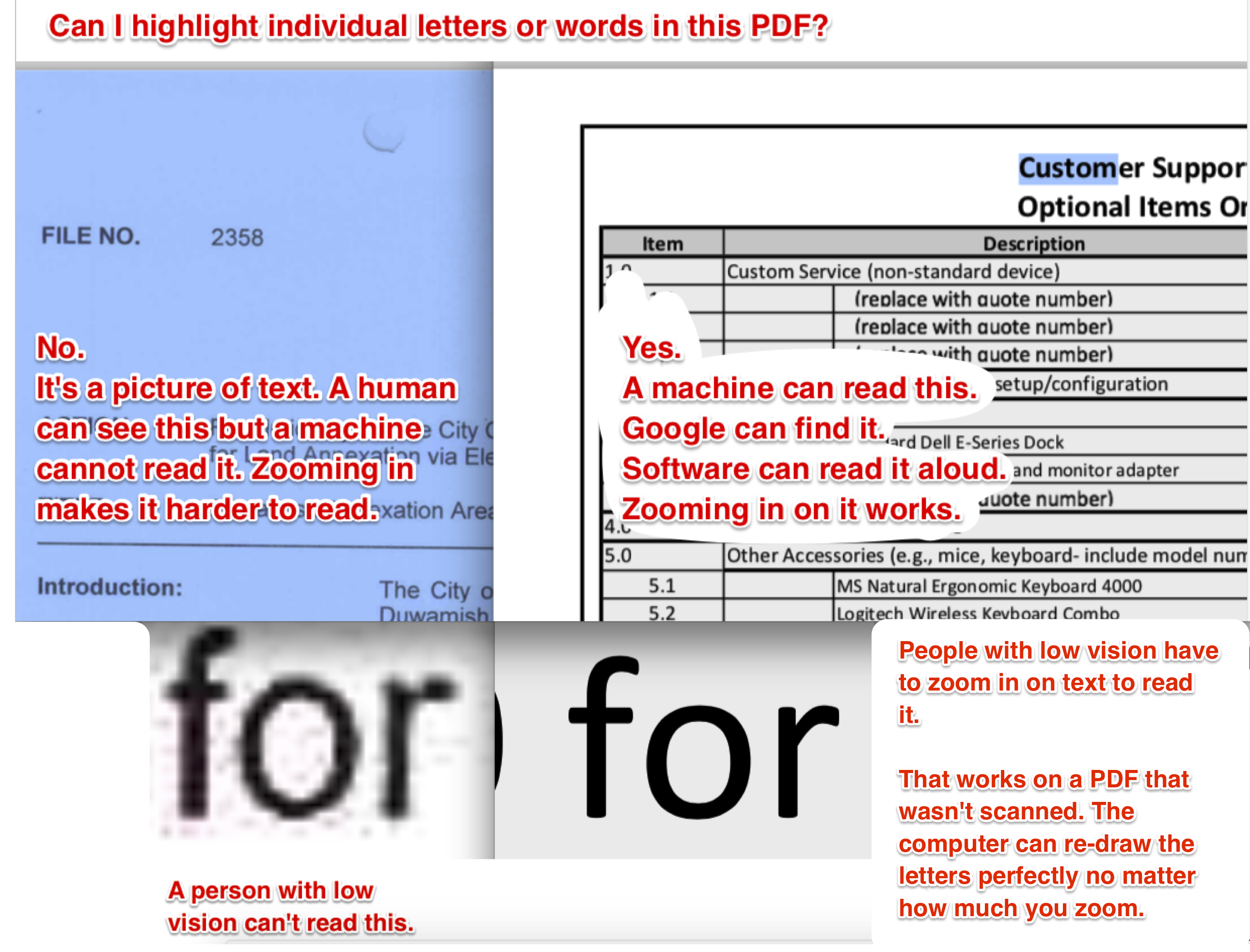
By the way, that drop-shadow behind the red letters will make it difficult for a low-vision person to read.
Many users cannot use a mouse and must use a keyboard to navigate a page. Try going to a King County web page and click tab to move through your page. Hitting enter is how you click on a link.
The Sitecore templates allow you to tab through the page, but you should always check that your code didn't break the ability to tab through your page.
One area where your code might break the tabbing ability is in a form. Always check your forms for tabbing before you launch your page.
Why it matters
Always consider file size when posting content to your page. A large number of our users are accessing our websites using mobile devices, and many of those users have limited data plans that will be hit if you post high-resolution photos or don't warn them about file size when downloading large documents.
For images:
Sitecore's responsive templates will resize your 4MB image to render as if it's a smaller one, but the user will still have to download the full 4MB file. Consider the largest size your image will display. Make your image that size by using Photoshop or an online photo editor such as Pixlr.
Here's how to use Pixlr:
- Upload your image
- Select Adjustment > Resize > Keep proportions
- Type the new width
- Apply and save the image
For file downloads:
- If the file is over 1MB, consider adding a file size to the link.
Learn how to produce accessible content
You will need a Siteimprove account to access these premium training materials . Need an account? Send a request to webteam@kingcounty.gov.
In depth training as of December, 2022:
- Inclusivity Program Design Certification
- Accessibility as a Priority in Your Organization
- Accessibility Auditing Websites for Complaint Resolution
- Accessibility for Designers
- Accessibility for Excel
- Accessibility for Marketing Emails
- Accessibility for PDFs
- Accessibility for Purchasing
- Accessibility Fundamentals for the Web
- Accessibility Testing for the Web
- Accessibility Testing in your Organization: A Holistic Approach
- Accessibility with WCAG 2.1
- Fundamentals of Descriptive Transcripts
- Learning Path: Accessibility Champion
- Learning Path: Accessibility for Content Contributors
- Learning Path: Accessibility for Leadership
- Learning Path: Accessibility for Marketers
- Learning Path: Accessibility for Microsoft Office
- Learning Path: Accessibility for Web Developers
- Learning Path: Complimentary Courses
- Learning Path: Comprehensive Document Accessibility
- Learning Path: Mastering Web Optimization with Siteiimprove
- Learning Path: Web Fundamentals
- Siteimprove Accessibility: Next Generation
- Accessibility for Documents
How to Test and Remediate PDFs for Accessibility Using Adobe Acrobat DC
Evaluate published files and update them so they're accessible. This video series describes how to accomplish this job.
Using a screen reader
Learn what life is like for a blind website visitor, comparing an accessible website with an inaccessible site. Learn how to navigate a page using a screen reader.
IT accessibility: what web developers have to say
Accessibility is part structure and part content design.
Accessibility tools
King County uses the Siteimprove tool to generate ongoing accessibility reports. If you already have access to Siteimprove, just follow the link to the online version and look under "Accessibility."
- Siteimprove accessibility analytics
Need an account? Send a request to webteam@kingcounty.gov. - Siteimprove Google Plugin
- Accessibility cheat sheet
- Expedia Accessibility Guidelines: Expedia has publicly shared their excellent distillation of the Web Content Accessibility Guidelines
- The Web Content Accessibility Guidelines (WCAG) 2.2 provide the criteria for accessibility.
Accessibility is the ability of people with disabilities to use software or consume information equally to people without disabilities. Just a few of the most common accessibility concepts include:
Color choice — being sensitive to the fact that 4.25 % of the population can’t see red and green, and people over 55 have difficulty reading text with poor contrast against the background color.
Closed captioning — hearing loss is the most common congenital disability. People tend to lose hearing as they age due to noise exposure, infections, injury, or ototoxic drugs.
Keyboard access — to be accessible means NOT assuming that everyone can use a mouse or touch the screen. That means every function and component that can be accessed by mouse/touch must also be accessible from the keyboard.
Descriptions for non-text graphics — Alt-text is the ability to describe pictures for people who use screen readers. If the image is just decorative and not essential to understanding the page, you can omit the alt-text and Sitecore will take care of it.
Abilities and Barriers Board
| Types of disability | Cognitive | Physical | Visual |
|---|---|---|---|
| Someone’s functional capability could be affected by: | having autism, dyslexia, or a learning disability | having a condition like arthritis, cerebral palsy, fibromyalgia, or lupus | being blind |
| being tired, stressed, or depressed | having an injury | being colour blind (color vision deficiency) | |
| reading something that’s not in their first language | having decreased and less precise motor control (perhaps from old age) | having low vision or poor eyesight (perhaps from old age) | |
| being distracted or in a rush | being in a moving vehicle like a bus or train | being outside on a sunny day with a shiny screen |
Source: Disability is a Spectrum, not a Binary, by Steve Barnett and Nicola du Toit
*King County may change requirements as we learn priorities and preferences of affected residents.
Why is accessibility on our websites important?
It is a civil rights issue and is required by law
The Americans with Disabilities Act (ADA) requires infrastructure and websites be designed for people who have disabilities. Accessibility also supports equity and social justice in the services King County provides to the public.
Accessibility is important for many people
Lax accessibility can create barriers for users with vision impairments, hearing loss, physical disabilities, cognitive and neurological disabilities, or speech impairments. It can also be difficult to access our website for non-native English speakers or people who don't have access to high-bandwidth Internet or only have mobile devices. Tools that people might use include: accessibility settings on their computer, keyboards or other special equipment to navigate through a page, voice page navigation, and screen readers.
It helps people find what you publish
Many accessibility requirements make information easier for search engines to find. For example, a portrait of “Dow Constantine” is likely to display in an image search if “Dow Constantine” is also in its "alt" text, and a PDF document that’s run through optical character recognition (OCR) conversion is more likely to show up in search results. Search engines also make use of text in links to sort results; if words/phrases are used in links to a page, that page will rank higher for related searches. In this way, King County can reach a larger audience and serve a larger customer base.
Accessibility improves our website's quality
In design competitions, judges will rate King County’s website quality in part on our policies for accessibility and on observations of how thoroughly we follow our own policies. If we want an award-winning website, we must make the website accessible.
It's the right thing to do
Helping make life easier for people is part of building the nation's best-run government.